◯ Asset / Logo animation
◯ Tags / Logo, Motion
◯ No. / 2
◯ No. / 3
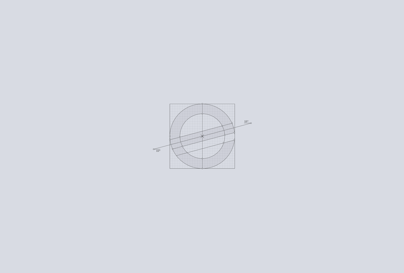
◯ Tags / Logo, Guidelines
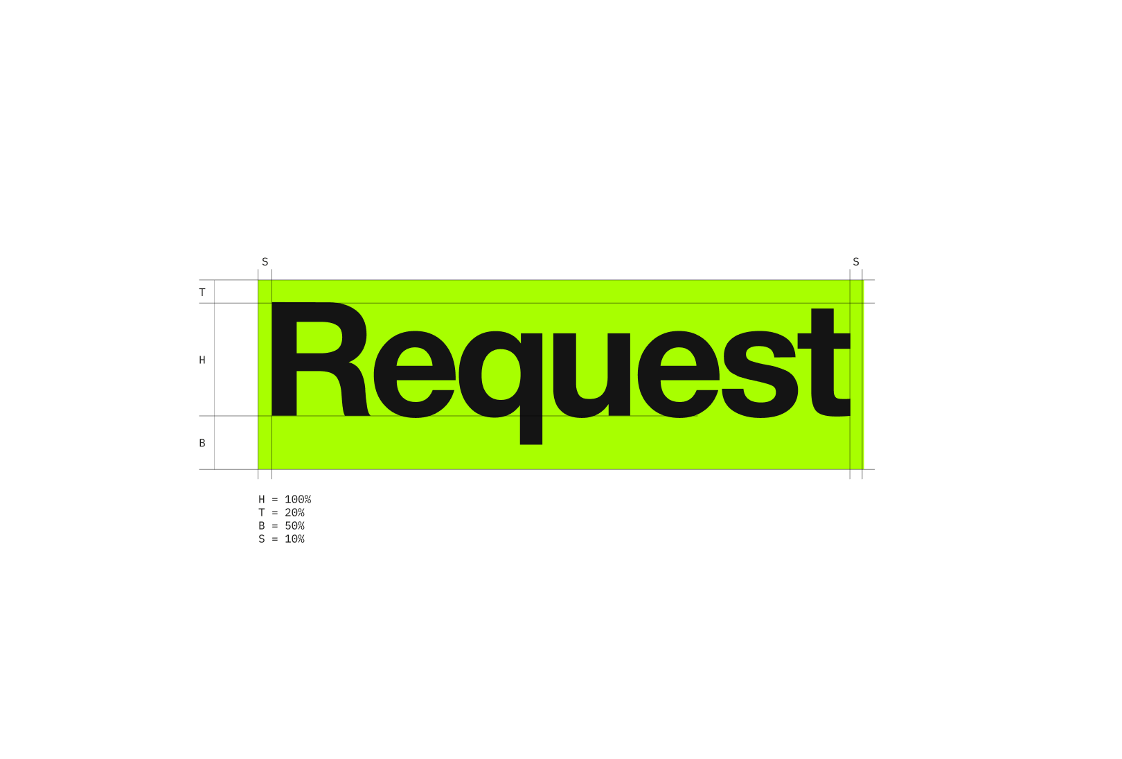
◯ Asset / Symbol construction
◯ No. / 4
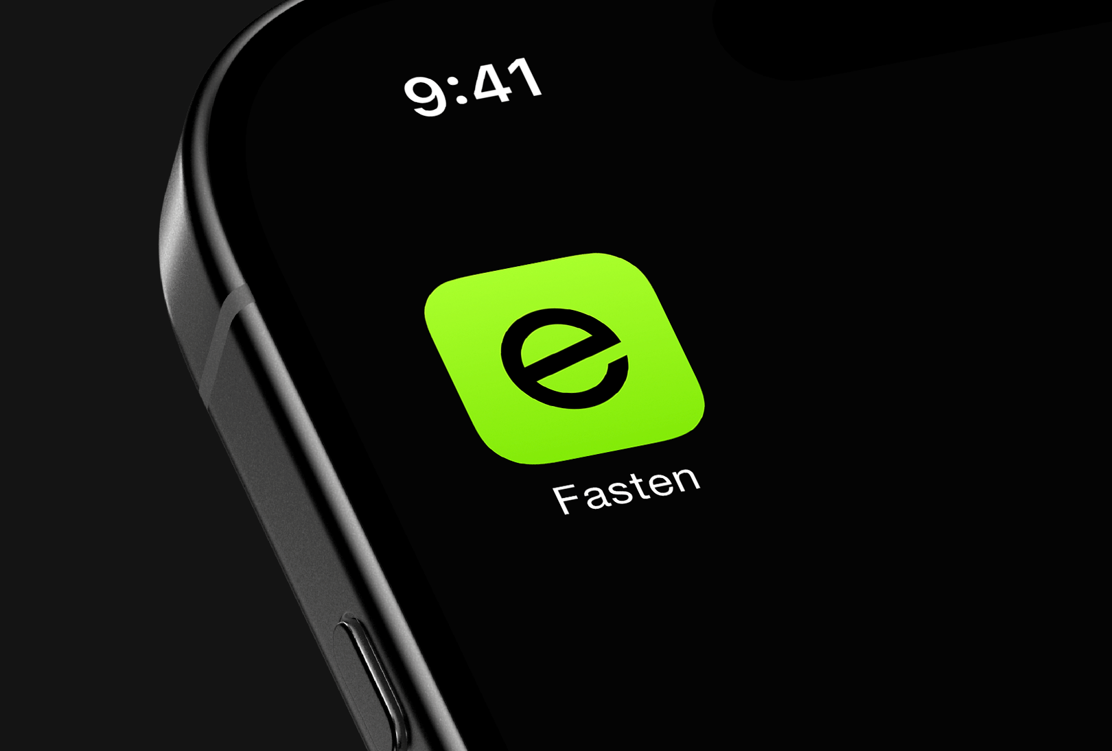
◯ Tags / Logo, App
◯ Asset / Fastem app icon
◯ Asset / Windshield beacon
◯ Tags / Logo
◯ No. / 5
◯ No. / 6
◯ Tags / Color, Motion
◯ Asset / Core brand colors
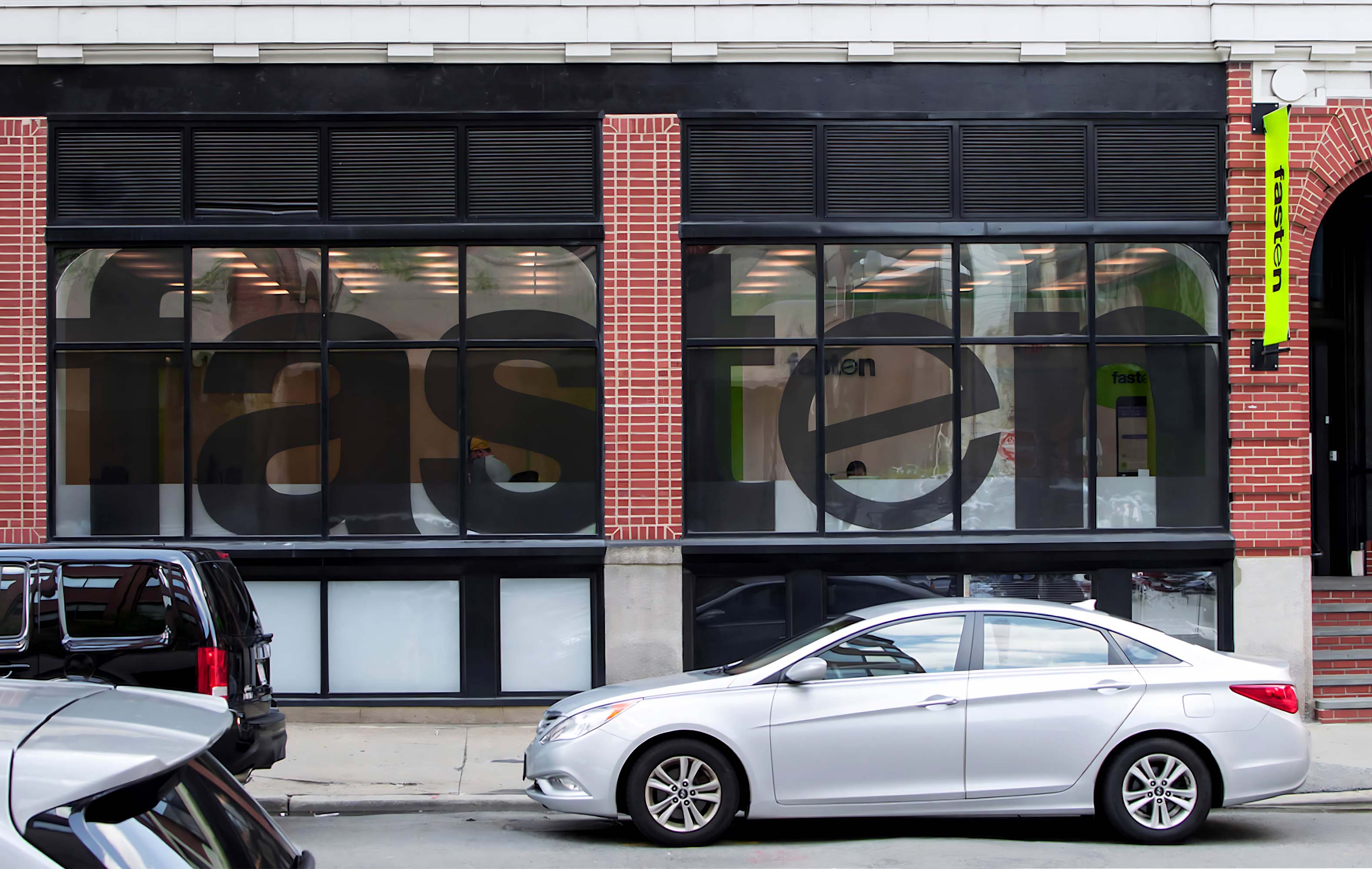
◯ No. / 1
◯ Tags / Logo, exterior,
◯ Asset / Fasten office
Explore more projects:
⬤ Smartcat
Fasten was a ride-hailing startup that operated in Boston and Austin, aiming to offer a fairer alternative to existing services by charging drivers a flat fee instead of a commission. The company focused on transparency, affordability, and better driver earnings, gaining significant traction in its markets. With a sleek, user-friendly app and a strong brand identity, Fasten attracted over a million downloads and tens of thousands of active users. I joined Fasten in 2016 to head up the startup’s design efforts.
Fasten
Brand design • Marketing communications design • Website design • Mobile app design • Social media design • Presentation design
April 2016—Nvember 2018
◯ [Work 03-01]
◯◯ [Work 03-02]
◯◯◯ [Work 03-03]
◯◯◯◯ [Work 03-04]
⬤ Project
⬤ Timeframe
⬤ Description
⬤ What I did
Ilya Sizov
© 2026
Twitter Bluesky
@ess-i-zee

@ilya_sizov
@defunxe
@ilya-sizov
isizov
My audiovisual art
Notion database
Things that inspire me
Multimedia art project
Unsteady flow of routine

⬤ Work
⬤ About
◯ No. / 7
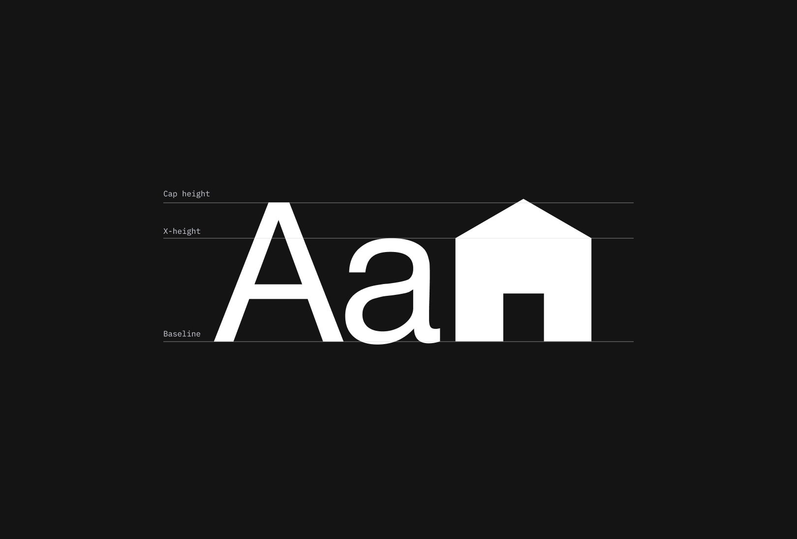
◯ Tags / Typography, Motion
◯ Asset / Brand typeface
◯ No. / 8
◯ Tags / Typography, Iconography
◯ Asset / Icons and glyphs alignment
◯ No. / 9
◯ Tags / Iconography
◯ Asset / Icons construction
◯ No. / 10
◯ Tags / Stationery
◯ Asset / Stationery
◯ No. / 11
◯ Tags / Ad, Photography
◯ Asset / Ad billboard
◯ No. / 12
◯ Tags / Guidelines, Typography
◯ Asset / Word highlight guidelines
◯ No. / 13
◯ Tags / Guidelines, Ad, Grid
◯ Asset / layout grid guidelines
◯ No. / 14
◯ Tags / Web
◯ Asset / Favicon
◯ No. / 15
◯ Tags / Web
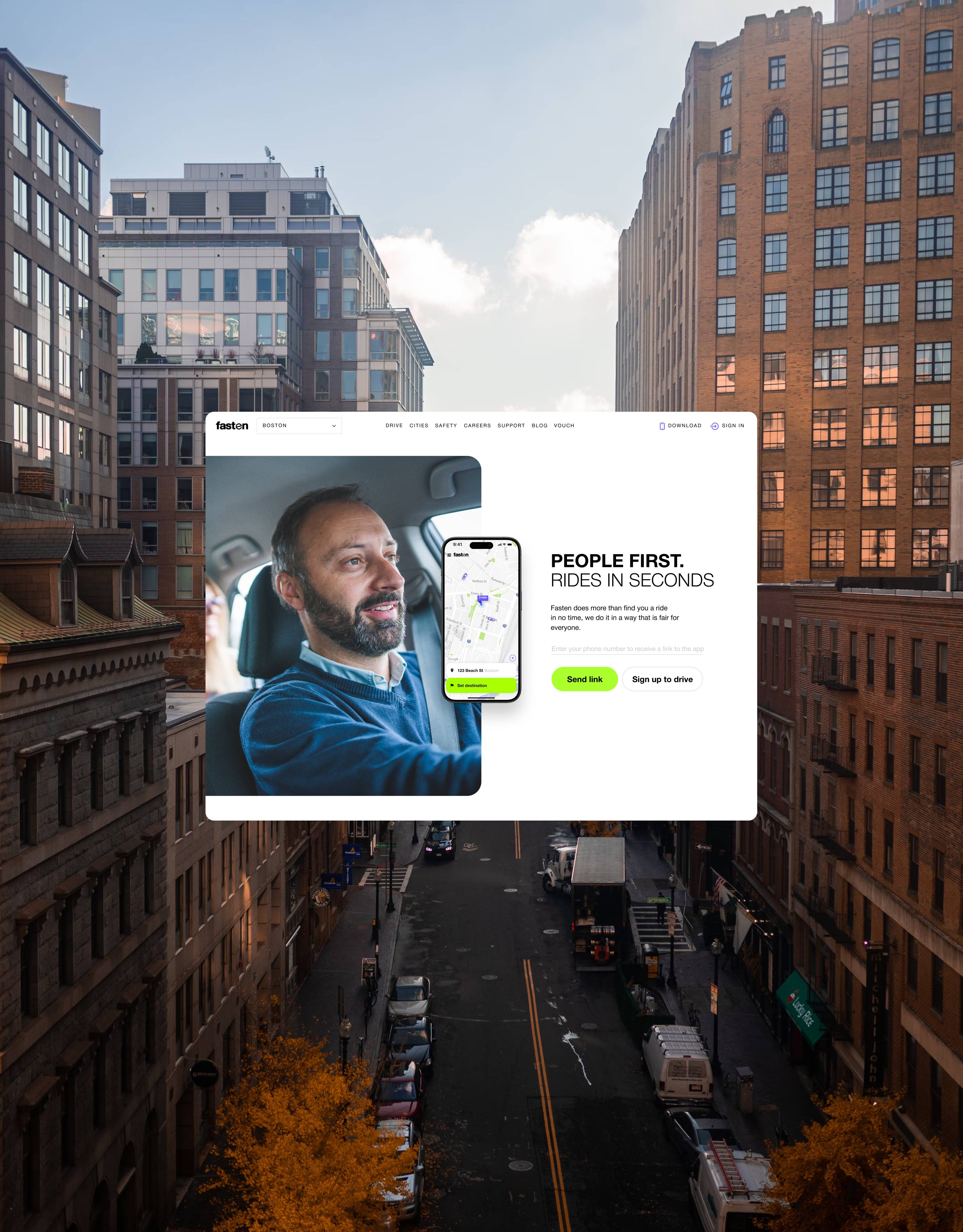
◯ Asset / Website home page
◯ No. / 16
◯ Tags / Web
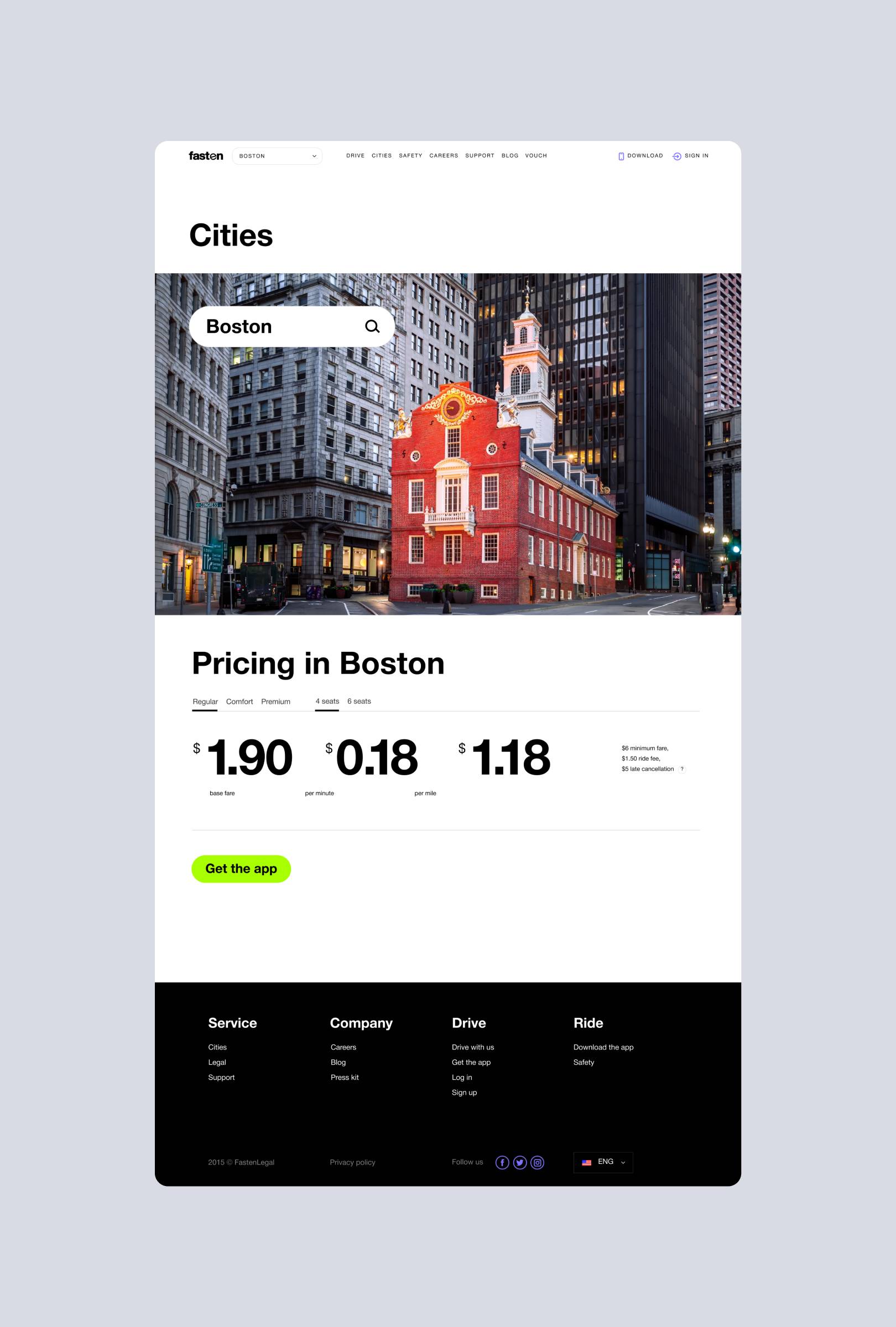
◯ Asset / Cities page
◯ No. / 17
◯ Tags / Web, Mobile
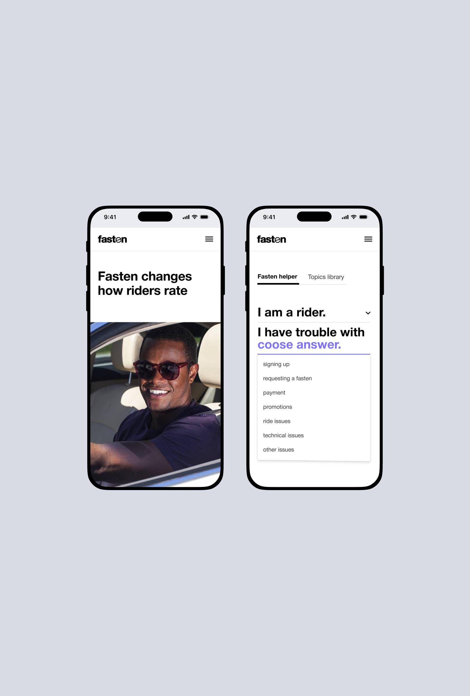
◯ Asset / Mobile versions of the pages
◯ No. / 18
◯ Tags / Web
◯ Asset / Fasten helper
◯ No. / 20
◯ Tags / App, iOS
◯ Asset / Fasten iOS app
◯ No. / 21
◯ Tags / App, iOS
◯ Asset / Fasten iOS app
◯ No. / 22
◯ Tags / Logo, App
◯ Asset / Fasten app icon
◯ No. / 23
◯ Tags / App, iOS
◯ Asset / Fasten iOS app
◯ No. / 24
◯ Tags / App, iOS
◯ Asset / App design elements
◯ No. / 25
◯ Tags / iOS, App
◯ Asset / Fasten iOS app
◯ No. / 26
◯ Tags / Identity, video
◯ Asset / Brand assets in real life
⬤ Core brand elements
◯ No. / 19
◯ Tags / Identity, Video
◯ Asset / Brand assets in real life
⬤ Idenitty application
⬤ Website
⬤ Mobile app
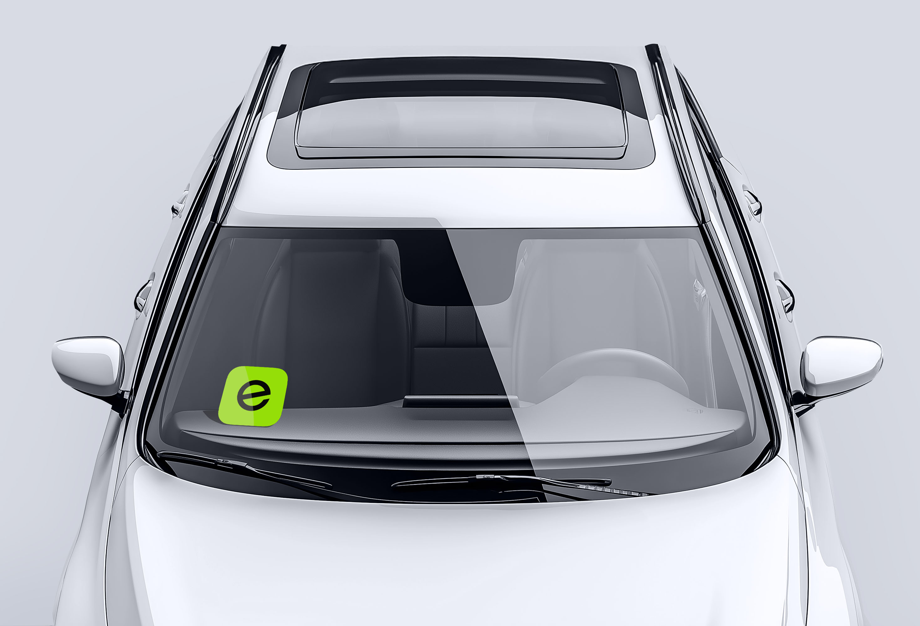
The Fasten logo combined movement and stability. The "e" subtly referenced a steering wheel, while the timeless clarity of the Helvetia font anchored the design. This fusion of fast evolution—perfect for a rapidly growing startup—and trust, which lay at the heart of the brand, was further enhanced by the black and white base, with a vibrant green accent that balanced steadiness and energy.
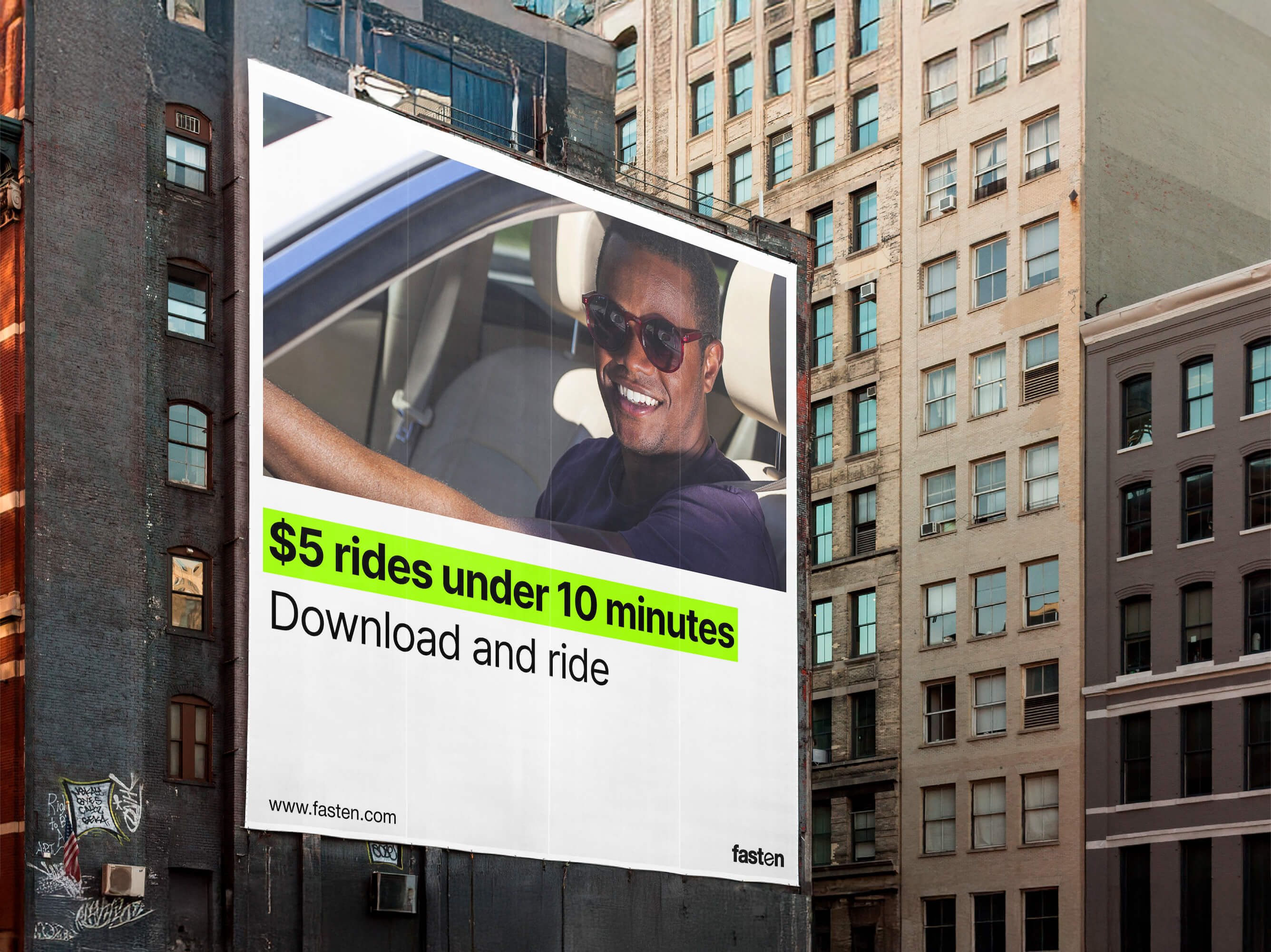
The vibrant green was a key element of the Fasten identity, with its bold presence on white surfaces symbolizing the freshness and novelty of the ideas Fasten brought to the industry. Large headlines with green highlights were the perfect visual choice for conveying the Fasten message, effectively drawing attention and reinforcing the brand’s core values.
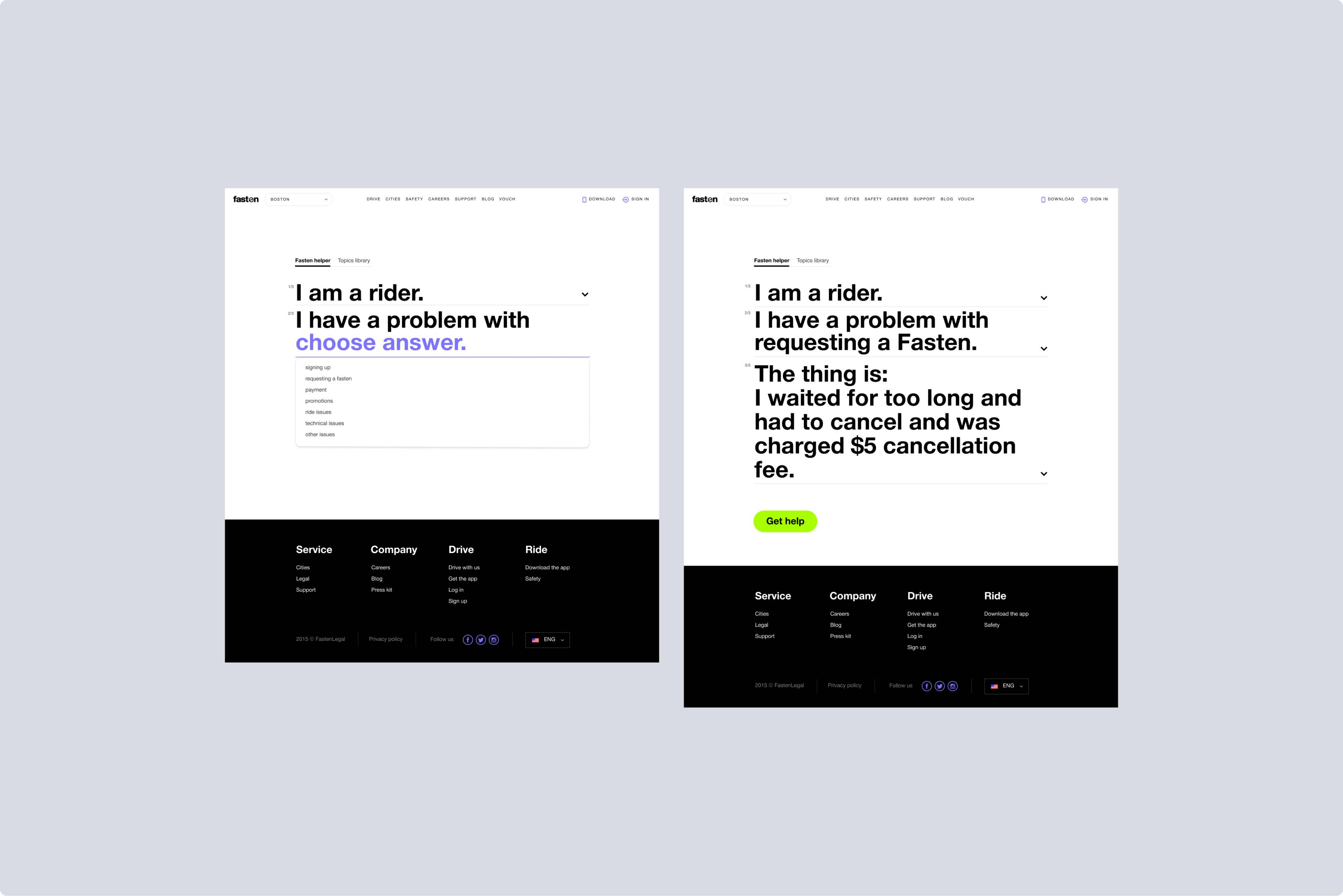
The Fasten website was built around one uncompromising principle of extreme simplicity. In a market flooded with vague promises, Fasten’s site stripped everything down to the essentials—just enough to get riders moving and drivers on board. Clear structure, minimal copy, and bold, purposeful visuals made the experience feel as effortless as hailing a ride.
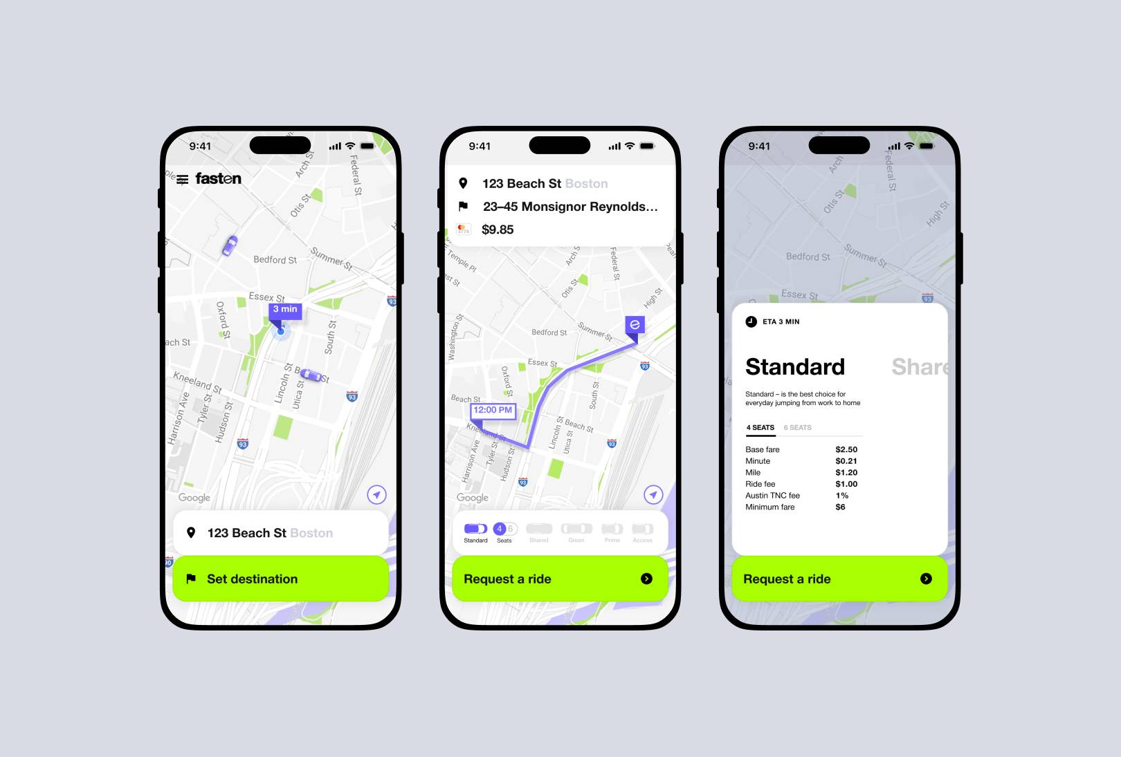
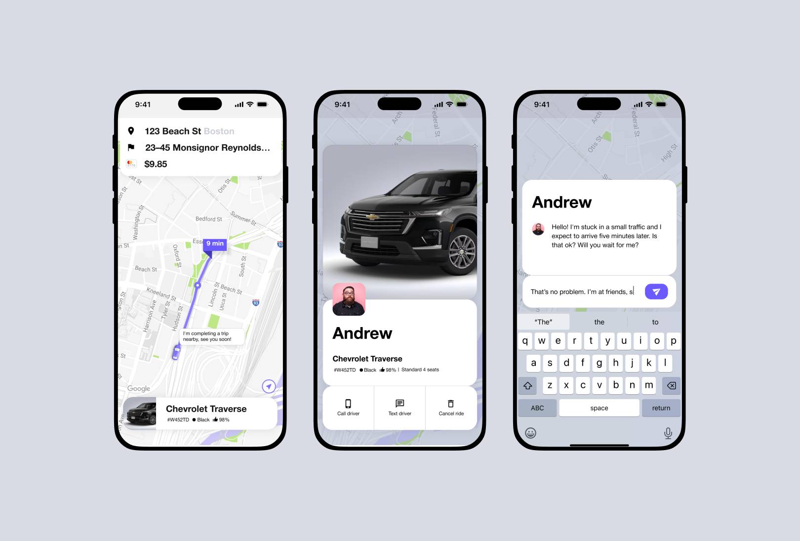
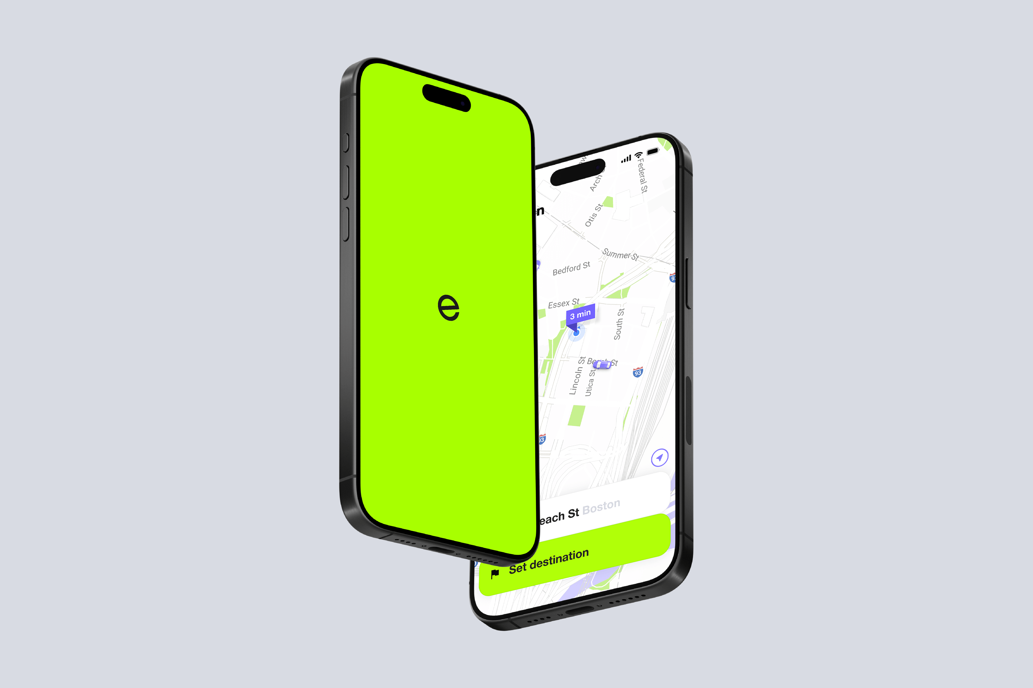
The Fasten mobile app was all about cutting the noise—clean, fast, and built for real-world use. Just like other elements of the brand identity, it didn’t try to show off—it just worked, with a quiet confidence users appreciated. It reflected the company’s slogan, “People first. Rides in seconds,” by putting clarity, speed, and human needs at the center of the experience.